* Expose to the Right Revisited
* f2 Cameracraft digital edition available for FREE!
* Pioneering Website Design
* Unobvious Things about the Fujifilm X-Pro2 (video)
* Various Updates
Expose to the Right Revisited
Once upon a time there was an esoteric technique for reducing noise at high ISO called "Expose to the Right". It worked like this: You overexpose the image by about a stop or so (but not so much that you'll blow out the highlights!), and then bring the exposure back down in Photoshop. This technique reduced the noise by about 1-2 stops' worth, which was pretty good. Since those days, modern camera manufacturers have changed the way brightness values are represented in RAW files for efficiency, and some have claimed that this makes the ETTR technique less effective.
Is this true? I decided to find out.
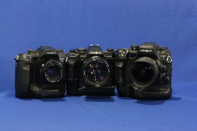
I dusted off my old Alpha 700 (12 MP, APS-C) and compared it to a modern-day A6300 (24 MP, APS-C) using the same setup and the same lens. Since noise is always most pronounced in the dark areas of an image, I figured I'd shoot a relatively dark subject. Three classic Minoltas should do the trick.
The first two shots were taken with the A700 using ambient light (vs. the image at the top of this post which was done with studio strobes). ISO was set to 3200, which is the camera's highest native ISO. The two images below were shot "straight" and with exposure compensation set to +1.3:
 |
| A700 EV0 |
 |
| A700 EV+1.3 |
 |
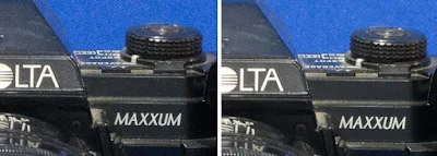
| Left: Straight exposure. Right: +1.3 and corrected in photoshop. |
Okay, let's do the same test again using the A6300 at ISO 3200:
 |
| Left: Straight exposure. Right: +1.3 and corrected in photoshop. |
Let's try it again at a higher ISO - say, 25,600, which is the A6300's highest native speed.
 |
| Left: Straight exposure. Right: +1.3 and corrected in photoshop. |
"Isn't it better to just shoot at low ISO to begin with", you may ask? I tried this experiment many years ago to find out. Below is a 100% crop of a test image taken with an A100 (remember that?)
 |
| Left: ISO 1600. Center: ISO 1600 using ETTR. Right: ISO 800 |
So do I ever use this proven noise-reduction trick in real life? No. If my light is so bad that I have to crank up my ISO to such levels, it means also that I don't have the luxury of overexposing by a stop or more. It's a good technique to know, but tripods coupled with low ISOs is a cleaner solution.
Fujifilm X-Pro2 ebook updates!
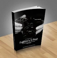
 Tony Phillips' celebrated book on the X-Pro2 has been updated to version 1.1, and with it the release of the .epub and .mobi versions for e-readers! Spread the word. If you had purchased the .pdf file from my website, you have already been notified of the update. If not, email me your purchase receipt and I'll take care of you.
 Tony also produced a new video showing of the "Unobvious things about the X-Pro2"; and it is included near the bottom of this post.
Also, the best-selling Sony Alpha 6300 ebook is currently being translated into French by photographer / linguist Jacques Vanhorick. Send me an email and I'll let you know when it's ready!
Seminars
No seminars are being conducted this year due to another project I'm working on this summer, but I'll bring the seminars to your camera club if invited. I'm in talks with 2 camera clubs currently, one of which the date has been set for February 2017 near Tuscon, Arizona. It's not listed on my website, so if you want to attend, you'll have to join their club. :-)
f2 Cameracraft - the digital edition is FREE!
The latest issue of f2 Cameracraft is going to press as I write this. The article I'm most excited about is the one I wrote describing Aaron Draper's glamor-lit portraits of homeless people he did across the U.S. and the impact it has had in their lives. You can support this important collection-worthy magazine by subscribing to the print version, which offers the best printing in the business and offers a visceral experience that just can't be had on a computer screen.
And now, an announcement from the management: In an effort to boost readership (which in turn will attract more advertisers), we have decided to make f2 Cameracraft free to read electronically after a brief embargo. Subscribers to the print version will still get the material first, and will be the ONLY ones to gaze at the best printing in the business. These are meant to be collector's editions after all (much like the famed Minolta Mirror publications in the days of yore), and we are working hard to ensure their status as a fine art collectable publication.
The rest of you will be able to peruse it for free a minimum of 4 weeks after the magazine hits the newsstands. Have a look at last month's July / August 2016 issue, and feel free to share this with your friends online. Now you have a better idea about why I enjoy working on this magazine so much!
"As a matter of fact, yes, my website WAS designed in 1999!"
I get a lot of flack about how dated my website looks. I'm aware of it. What people don't realize is that it was created in the late 1990's, back when there really weren't any good solutions out there for what I wanted to do. And now it's so established that re-doing it will cause an unacceptable degree of disruption.
 |
| A boring picture of a construction worker gets used for articles about the labor market. |
 |
| This shot of a dreary hallway I took while in China was used in a music video. You can see it through the door at 3:45 and 3:48. If you blink you miss it. :-) |
 |
| A fast food menu? Yup! I licensed it to a math textbook company. |
 |
| A pizza company used this in a ticket giveaway promotion. |
So why haven't I updated the look and feel of the website? Several reasons, actually:
 1) IT STILL WORKS. The primary goal of the website is have my images found by search engines so they can be licensed, and it still does this nicely. Few people find what they're looking for by browsing. (The same is true for Getty Images as well.)
2) There are now a gazillion external websites all linking to thousands of my images on the site. Those links help increase my google ranking. Replacing the website with something more modern would break all those links and reduce (if not temporarily) my search engine ranking.
3) I made the mistake of not using CSS style sheets, making it a little harder to change the entire look and feel of the site.
4) There's no ROI for having someone port everything over to a new system.
5) Hey, if I wait long enough, 1990's-looking website will be back in fashion, just like 1970's era clothing and crappy-looking instagram filters are in vogue now. (Translation: This is the price you pay for being a pioneer.)
 |
| This one appeared in a book about bees. |
And Now, a Word From Our Sponsor
Next Time
How to shoot an Bharatanatyam Arangetram.
Until then,
Yours Truly, Gary Friedman
===
Want the greatest improvement in the shortest amount of time? My seminars are the way to go - enjoy the streaming version anytime, anywhere!


Gary, Interesting and educational as usual
ReplyDeletethanks for the tip re Adobe Portfolio. Its free, no ads and has to be a step up from Picasa Web which mucks around with set up all the time.
ReplyDeleteI agree that ETTR is still useful. I would add that you can expose to the right even using a tripod and low iso and end up with a higher quality image than without ETTR. It is about capturing the best exposure you can and then postprocessing to your vision
ReplyDeleteI shoot all Olympus now, and definitely expose to the right. At low iso, it is not as noticeable, but if I have a choice of overexposing a stop at 6400 or "correctly" exposing at 3200, the 6400 is better. At events I'm usually shooting A priority close to wide open, whatever the lens is. My basic exposure is +.7stop, then I add exposure until I see blinkies, then back up. Most of the time I can judge the exposure just from the look of the preview on back or VF, but blinkies are more sure. If there is a white tablecloth in the photo, I go ahead and let it blow out a bit.
ReplyDeleteHi Gary, I love your blog and website. Don;t sweat about the design, as you point out, it works... I did have one thought about its design though. What I guess a lot of people might find off-putting is the yellow text on grey background. Would it not be possible to at least just change these colours without causing any of the redesign problems you understandably seek to avoid? How about black text on plain white background, for example?
ReplyDeleteEasy to do, but everybody and his dog has a black-on-white website. My goal was to have a unique look yet still remain high contrast for easy reading. Can you suggest a different color combination that would be less mundane?
Delete